
How to Mix Neutral Decor
A lot of people love the idea of neutral decor, but it tends to cause overthinking. "This beige doesn't match that beige and this is the wrong shade of off white." Sound familiar? Do yourself a favor, don't overthink it. The key is balance. Having a good amount of neutral color variations in different textures will balance a room. Trying to match each shade of white/beige/gray won't look natural and it may drive you crazy, and it’s better to mix it up to add dimension to the room.
Here are a few examples to give you an idea of what I mean by balance.
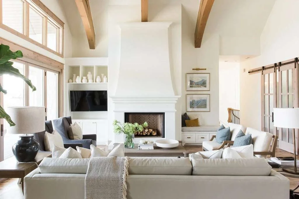

The above room pulls off neutrals beautifully. The sofas, pillows, rug and wall color are all different shades of creamy white/beige, but because they're all different textures, they flow well together. The subtle blue touches in the artwork, pillows and chairs give the room a bit of color without overpowering the neutral room.


Above are more examples of various shades of neutrals used together. Here, not only do the textures vary but patterns vary as well. Patterns are an excellent way to jazz up a neutral room so it doesn’t feel too bland. Again, balance is key. Be sure to use large and small patterns together. Too many large patterns can appear too bold; too many small patterns appears to be busy.

Once again, a wonderful example of mixing patterns and textures. There’s both rough and soft textures layered giving the room dimension.
Struggling with paint colors? Check out my post here for tips! Have questions? Comment below!